FRAME Loading Screen
WebXR work for Frame by Virbela, a US-based company (California, San Diego).
The improved FRAME loading screen is another task I completed soon after starting at Virbela.
For this task, I worked on:
- Creating the CSS animation
- Tweaking to the old logo for better visual balance (v1)
- Making the loading screen responsive by using media queries
- Updating the loading screen so that it could use the new FRAME logo (v2)
Demo Video
The below video shows v2 of the FRAME loading screen, with the responsive encircling animation and logo updating their size as the window dimensions change.
The Making Of
Old Logo Adjustments
As anticipated, I created v1 of the improved loading screen when the FRAME WebXR platform still used a generic logo and the old Virbela logomark.
However, the design process required some extra steps to adjust the old FRAME logo and achieve good visual balance before I could focus on creating the encircling CSS animation.
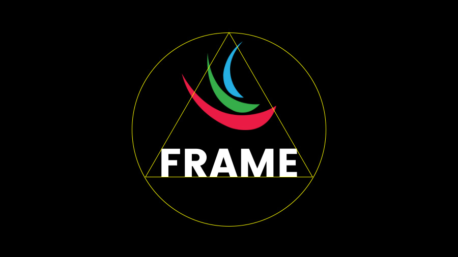
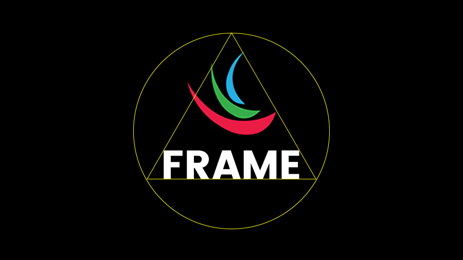
The two images below show the before (LHS) and after (RHS) versions.
In particular, the tweaked logo on the RHS uses:
- A scaled-down logomark
- Minor letter-spacing adjustments to the logotype
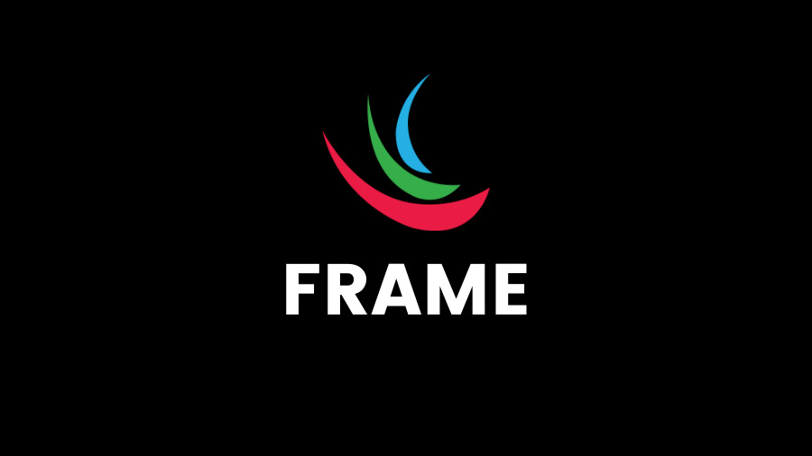
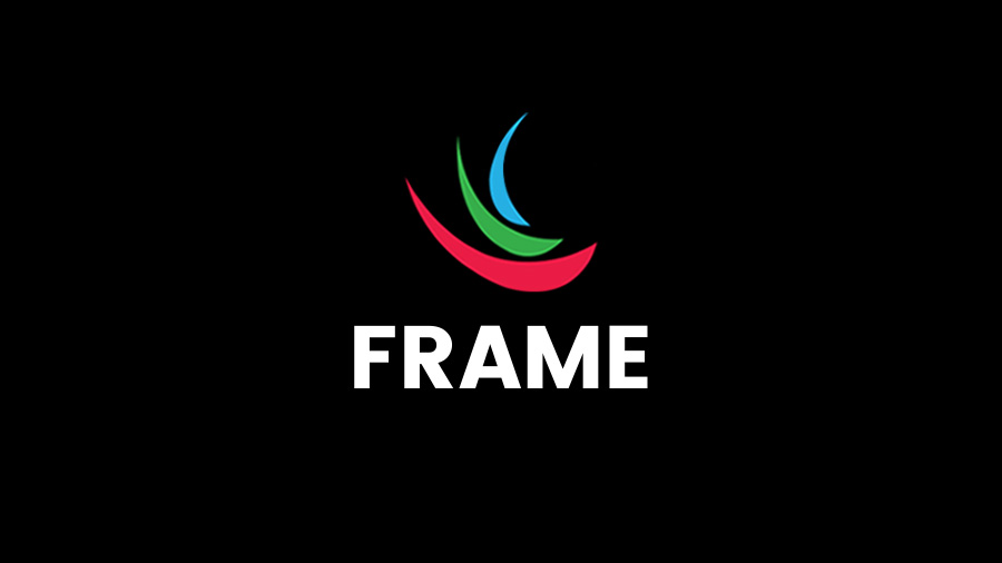
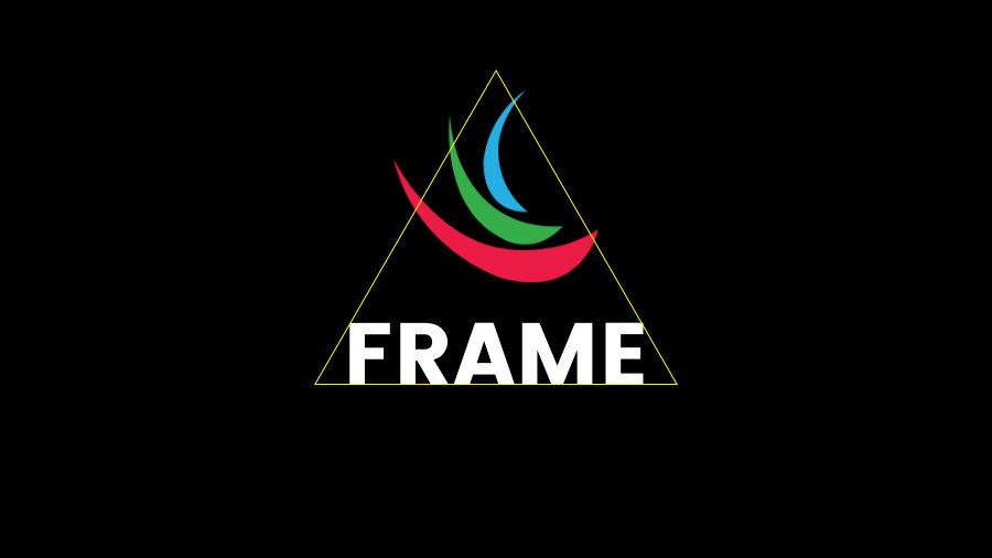
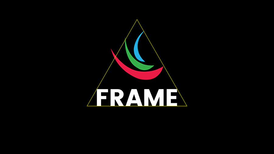
While the difference between the two logos above might be evident only to a trained eye, the images below show more technically the improved balance achieved by using a triangle shape to define the logo's bounding area.
In the images below, instead, the triangle is nested inside a circle shape to get an even better perception of how the blank space between the logo and the encircling animation would be distributed.
Implemented Loading Screens
The 3-step sequence in the demo video below shows:
- Validation of the adjustments made to the old logo
- The improved FRAME loading screen v1 using the old logo
- The updated FRAME loading screen v2 using the new logo
Related Works
Check out more works for FRAME by Virbela:
