FRAME Welcome Area
Spatial Onboarding Experience
Designing spatial onboarding for a WebXR collaboration platform, helping first-time users understand features and get started quickly.
Context
FRAME is a browser-based WebXR platform that allows teams to create and explore virtual environments.
The Welcome Area serves as the entry point for first-time users.
It introduces the platform’s capabilities and helps users understand how to get started.
Problem
The original Welcome Area did not clearly guide new users through the platform.
Information was difficult to scan and key actions such as creating an account or accessing documentation were not immediately visible.
This created friction for users discovering FRAME for the first time.
My Role
As WebXR Designer/Developer I:
- Reorganised the spatial information architecture.
- Redesigned wall content and interaction points.
- Created clearer calls-to-action for onboarding tasks.
- Optimised readability and performance for VR environments.
Key Design Decisions
1. Structure onboarding spatially
Each wall presents a specific area of the platform, allowing users to explore features progressively.
2. Introduce clear activation pathways
New CTAs guide users to:
- Create a FRAME account.
- Access documentation.
- Join the community.
3. Improve readability in VR
Font size, contrast, and layout were adjusted to ensure content remains readable in immersive environments.
4. Optimise performance
UI elements were consolidated into a single Babylon.js ADT to improve rendering efficiency.
Outcome
The redesigned Welcome Area provided:
- Clearer onboarding for first-time users.
- Better discoverability of key platform features.
- Direct pathways to documentation and account creation.
This created a more structured introduction to the FRAME platform.
Demo Video
This video shows the final result implementing a series of assets such as images, videos, 3D models and UI elements.
The Making Of
Information Architecture
The first step was to organise the information architecture.
Moreover, to include and display some extra information about other features I created:
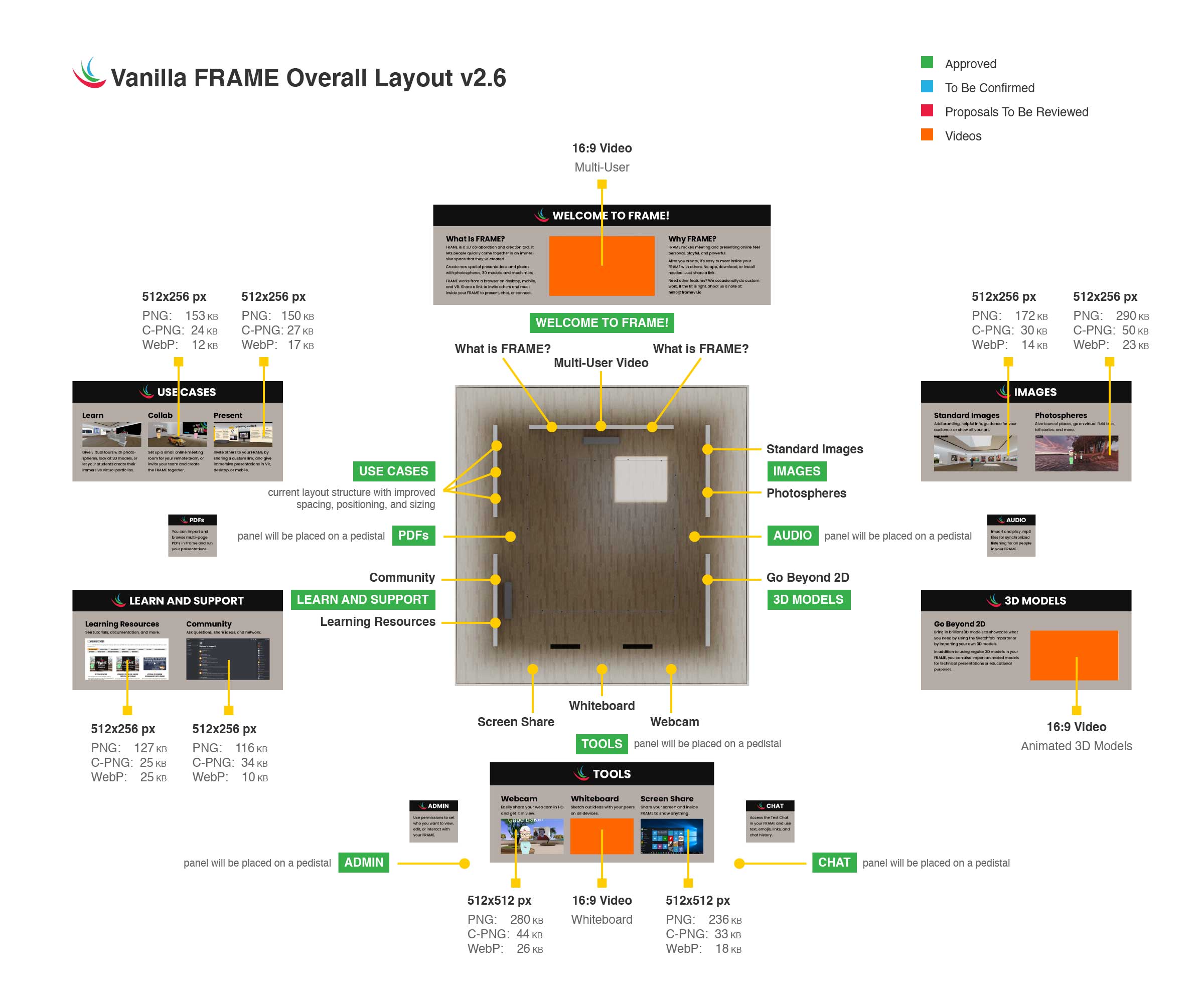
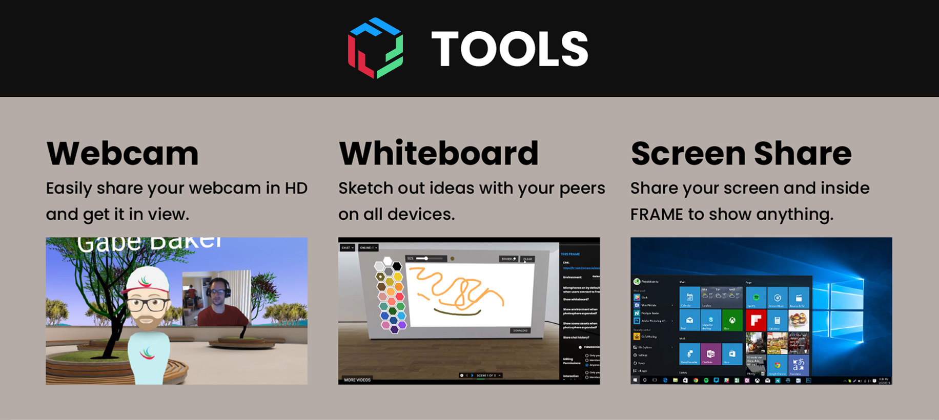
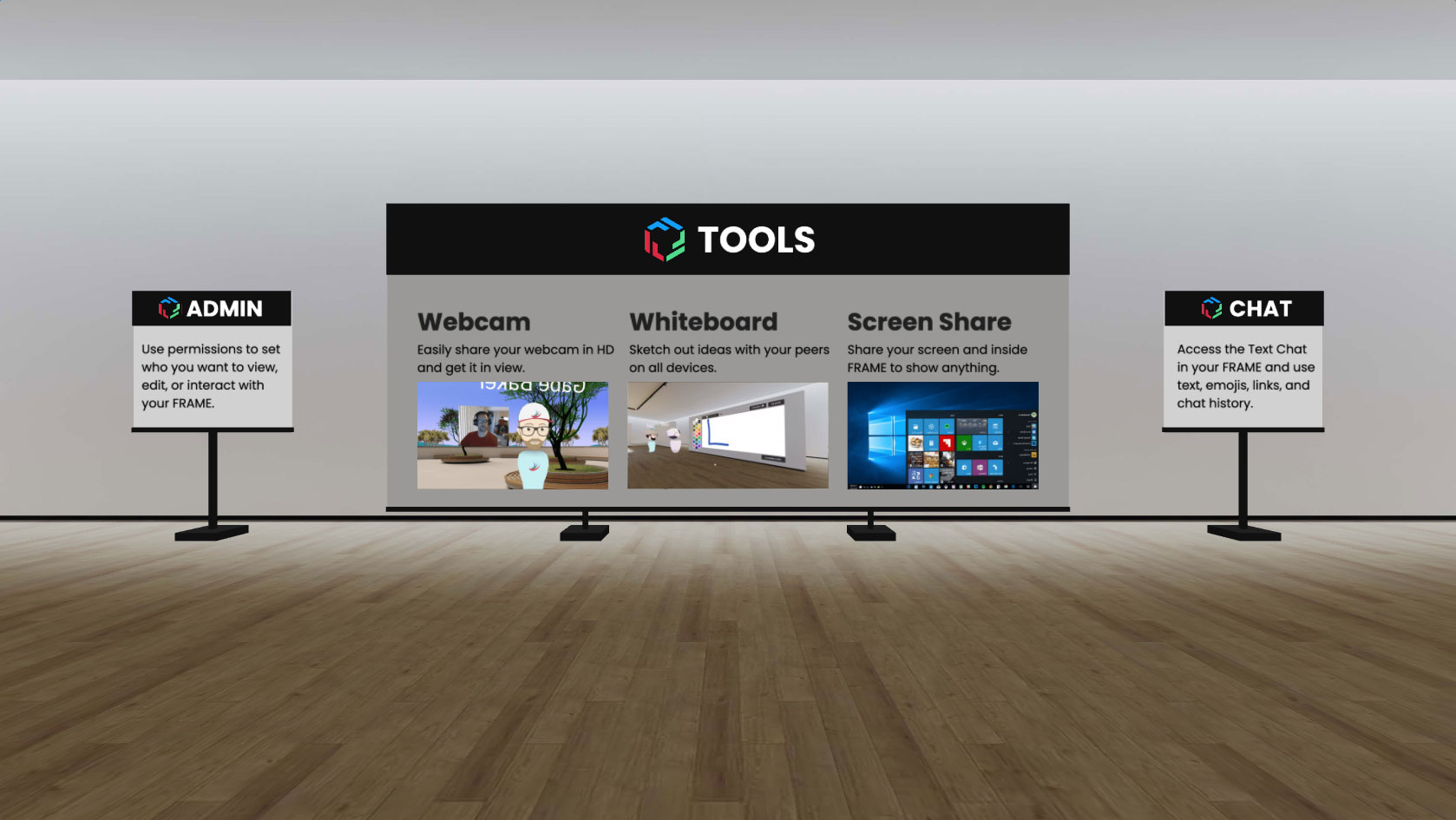
- One 3D model of a large pedestal (TOOLS)
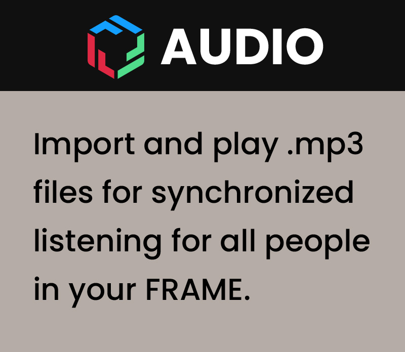
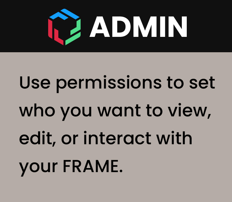
- Four additional 3D models of small pedestals (PDFs, AUDIO, ADMIN and CHAT)
The image below shows the different areas of the scene with walls and panels displaying their new specific content.
Original Version
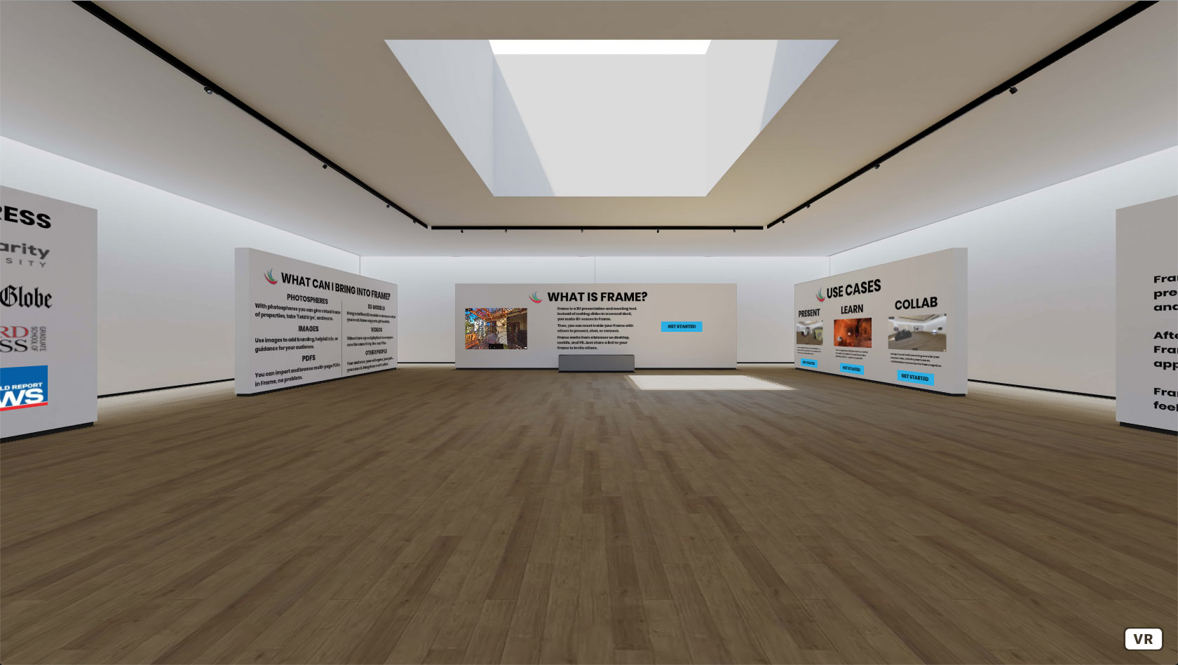
Below, instead, you can see a screenshot of the original version of the Welcome Area
Before vs After
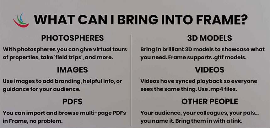
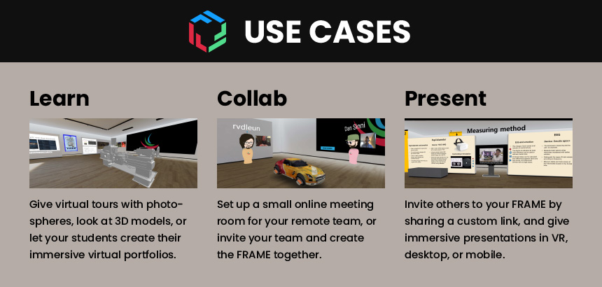
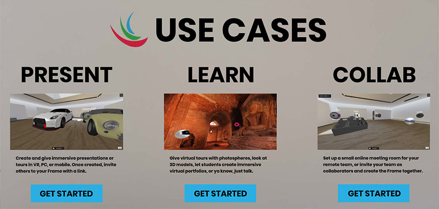
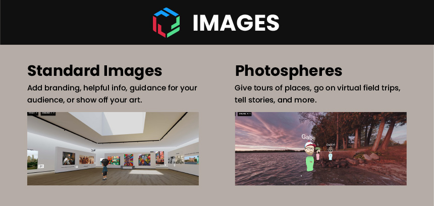
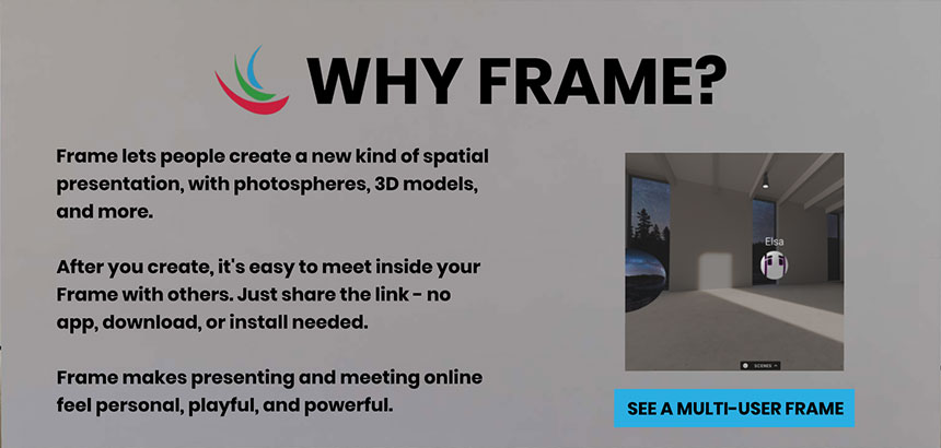
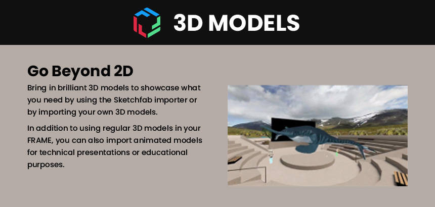
The process of reorganising and redesigning the content displayed on each wall started with static mockups.
The images below show the Before vs After comparison for each wall and panel.
NOTE: the mockups still use the old FRAME logo. I few months later, I also worked on its restyling, which is the one you can see in the demo video and in the final screenshots at the bottom of this page.




Additional Panels
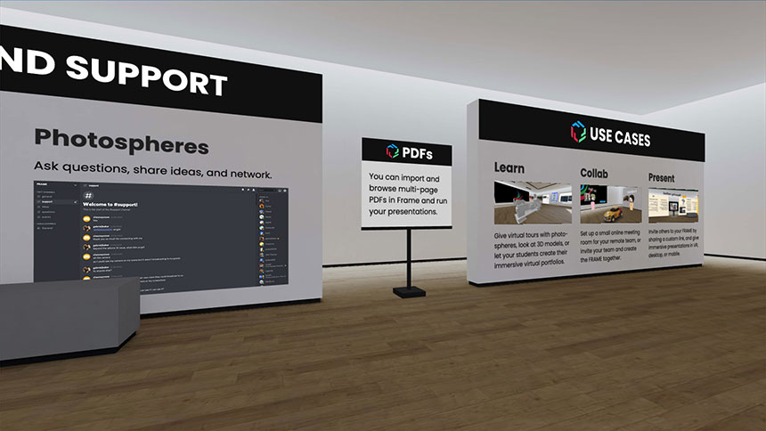
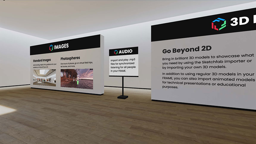
The images below show the content displayed on the large panel (TOOLS) and the four small panels (PDFs, AUDIO, ADMIN and CHAT).


WebXR Prototype
It's worth mentioning that the FRAME platform was initially built with A-Frame, a WebXR framework for Three.js. So that's the technology I used for the first version of the WebXR prototype.
Then, about one year after I started with the company, we rebuilt the whole platform using Babylon.js and, consequently, needed to replicate the restyled Welcome Area using this new technology.
In both cases, by creating a WebXR prototype and working in an isolated environment, I could speed up the design implementation process and bypass the loading time that otherwise my local build would have taken each time I was making changes and adjustments or saving files.
The video below shows the second version of the WebXR prototype I created in Babylon.js.
In particular, the video also highlights an issue we fixed soon after, impacting the WebXR UI elements and caused by overlapping ADTs (Advanced Dynamic Textures).
Implemented Design
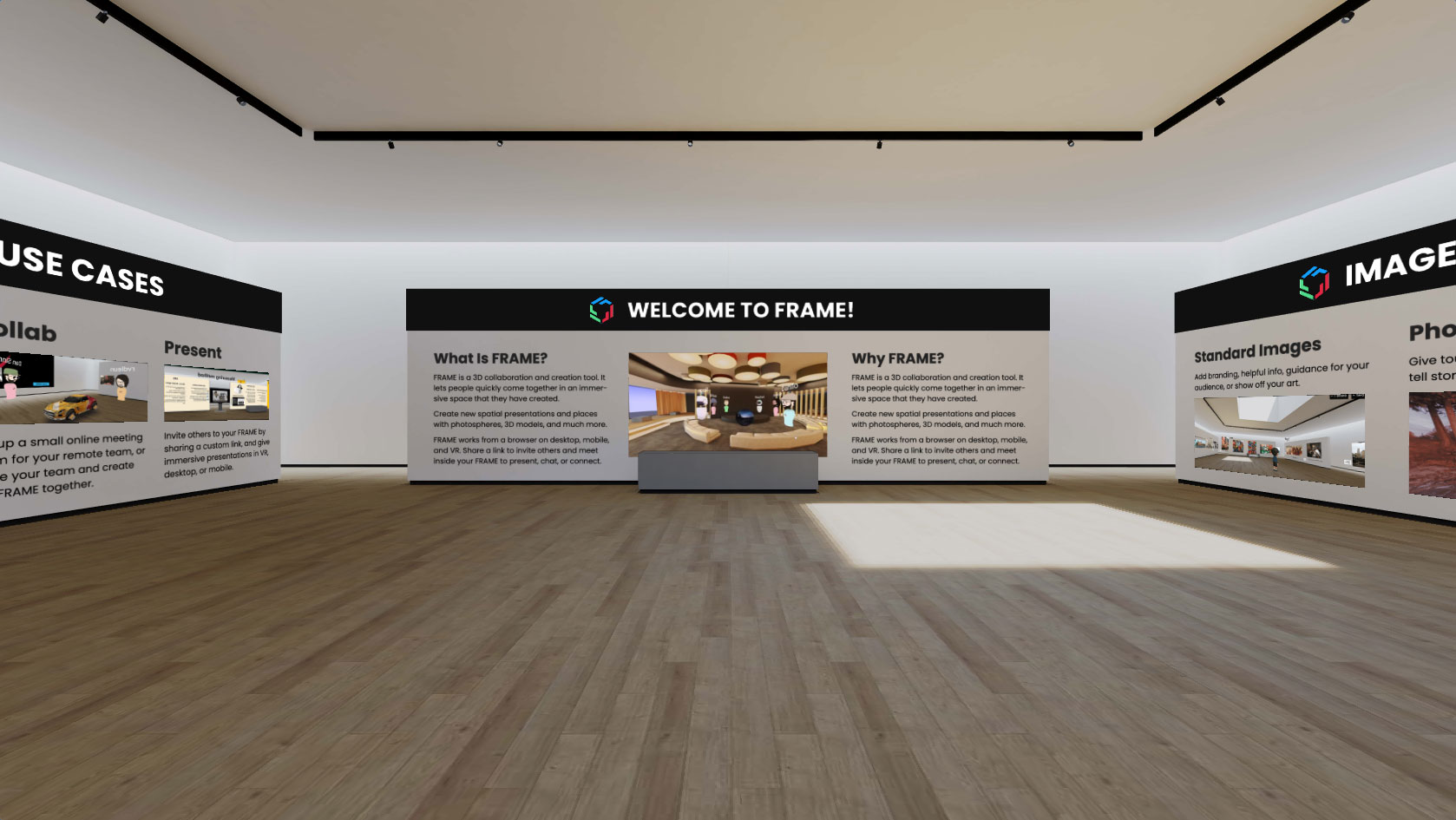
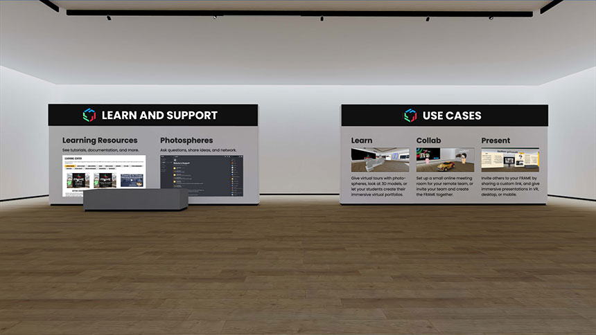
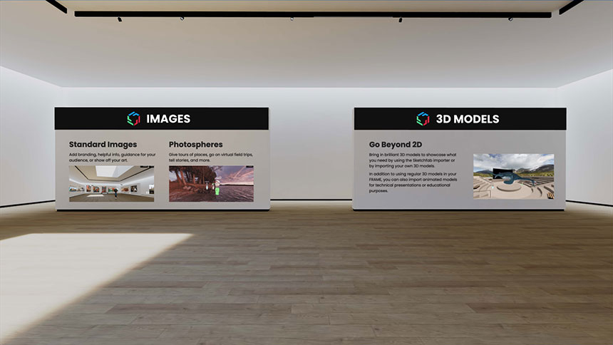
The images below show the content of each wall and panel finally implemented in the Welcome Area.
Related Works
Check out more works for FRAME by Virbela:
