FRAME Logo
WebXR work for Frame by Virbela, a US-based company (California, San Diego).
A few months after I started working at Virbela, the company decided to go through a brand restyling process.
Before this important milestone, the FRAME WebXR platform didn't have its own logo, meaning that the FRAME logo was composed of a generic FRAME logotype and the old Virbela logomark.
So, once Virbela presented the new restyled logo, they tasked me with creating a new logo for FRAME with the goal of making it look like part of the same family.
For this task, I worked on:
- Creating the design concept
- Designing the FRAME logomark
- Reviewing and validating the design with the Virbela Marketing Lead and the FRAME Team
Final Design
From left to right, the image below shows the new FRAME logo and its grayscale and B&W variants.
The new FRAME logo also includes an inline version as shown in the image below.
The Making Of
Original Versions
The images below show the old Virbela logo and the initial version of the FRAME logo using the Virbela logomark.
The Restyled Virbela Logo
With the restyling, Virbela incorporated similar colors and waveforms, while reflecting a lighter, modern font and a dimensional globe, representing the 3D worlds they build. it represents their vision for the future and what’s to come.
They also updated the capitalization in the written form of the company name. Not only does this change improve the legibility of the name, it also lends a more modern look that complements the new logo.
Finally, their new logo reflects what makes them unique, differentiates them in the marketplace, and ultimately, sets them up for the next phase of their growth.
Therefore the attention Virbela put in refreshing its brand identity automatically fuelled the importance for the FRAME platform to have its own new logo too.
The Design Concept Behind the New FRAME Logo
It's worth pointing out that Virbela's main product is a native VR software application.
By developing the FRAME platform, the company aims to provide an equivalent solution, taking advantage of the instant and frictionless experience that only the WebXR technology can provide.
This is a fundamental detail that I kept in mind while working on the design concept for the new FRAME logo, embracing the challenge of giving it its own identity while making the two logos look like part of the same family.
So, just like the sphere in the new Virbela logo represents the 3D worlds you can build, I saw in the cube the perfect 3D object to represent the same idea for the following reasons:
- Compared to native VR software applications, to optimise performance a WebXR app needs to use simpler 3D models both in terms of poly count/geometry and texture resolution (regardless of any types of compression)
- Together with the sphere and the cylinder (or the cone, which is a cylinder with the top cap scaled to 0), the cube is one of the three iconic 3D objects included in the Hello World scene of the most popular WebXR frameworks
- The shape of the letter F can be used as a face of a cube, so assembling three F-shaped graphic elements in an isometric perspective can create a nicely balanced logomark which looks just like a cube
The image below shows the first step I took using the Vectornator iPad app to bring the design concept to life.
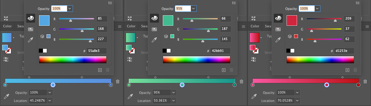
The Logo Colors
As the new FRAME logomark resembles a cube, its three F-shaped flat faces don't need to use any gradient color like the globe in the new Virbela logomark.
So to keep the colors in line with the institutional ones, as shown in the image below, I extracted from the new Virbela logomark three intermediate HEX values for us to use as plain colors in the new FRAME logomark.
Polishing the Logomark
For the next step, I imported the logo created with Vectornator into Illustrator and then applied rounder corners to the top-left corner of the F shapes.
Completing the Logo
The final step was about adding the FRAME logotype.
While the logo reasonably uses the same Grold Rounded font family, I kept using all uppercase letters to express the "similar but different" concept and relationship between XR and WebXR.
The images below show both the new Virbela and FRAME logos on white and black backgrounds and demonstrate how I achieved the goal of making them look like part of the same family.
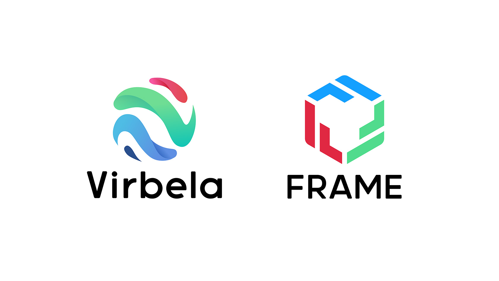
Main Versions of the New Logos
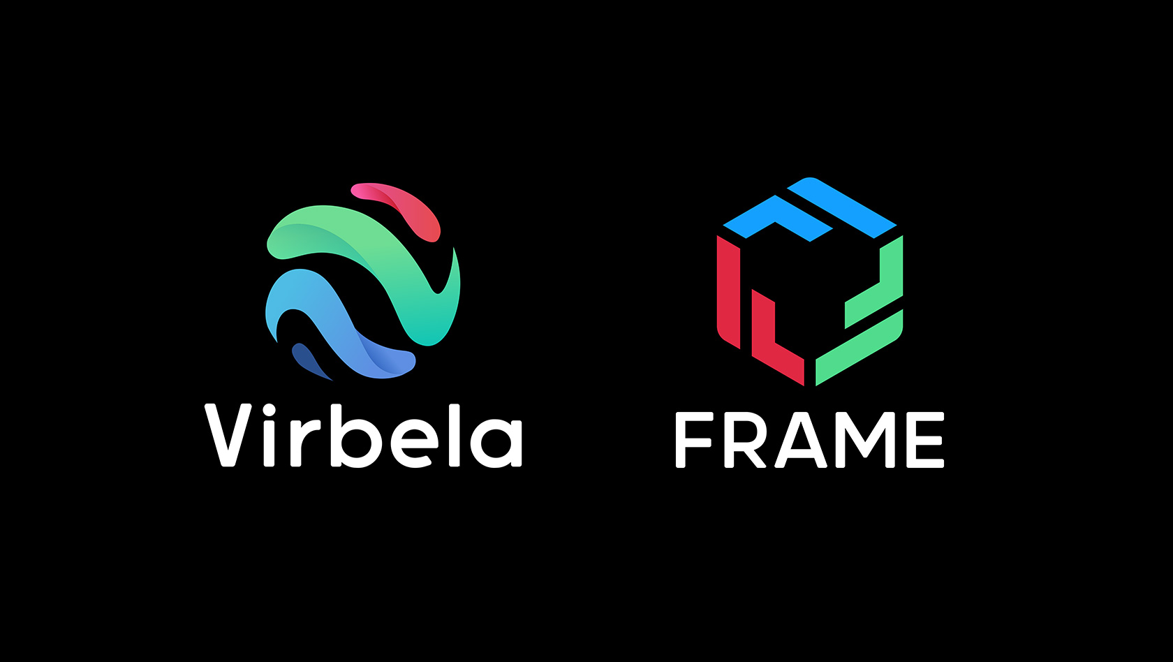
The two images below, instead, show the institutional versions of the two logos, where the opposite background colors emphasise once again the concept of being "similar but different", just like the XR and WebXR technologies.
Related Works
Check out more works for FRAME by Virbela: